
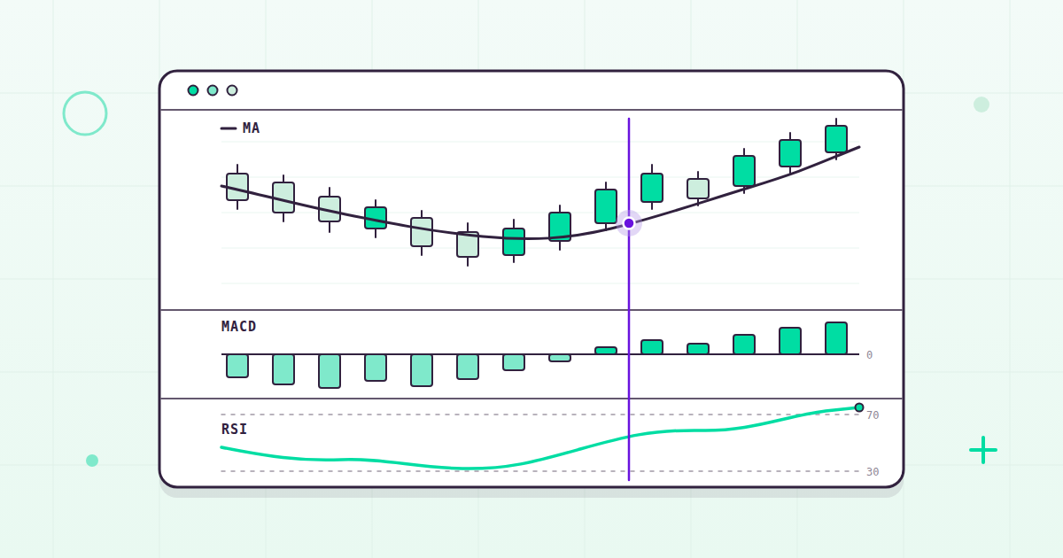
Open any charting platform and you’ll see them stacked beneath the price: RSI, MACD, Bollinger Bands, half a dozen moving averages. Technical indicators are everywhere in markets, and most explanations of them fall into one of two camps – breathless promises that they unlock the market’s secrets, or eye-rolling dismissals that they’re astrology for traders. Neither camp helps much if you simply want to understand what these tools are.
So here is the precise version. A technical indicator is a calculation derived from price and/or volume data, used to describe what a market has been doing. That’s the entire definition. Every indicator you will ever plot – every oscillator, band, and crossover – is a transformation of numbers already sitting on your chart. It can add clarity. It cannot add information.
Keep that one idea in mind and the whole subject gets far less mysterious. Below, we’ll go through the major indicators one family at a time: what each one computes, what traders use it for, and one thing it genuinely cannot do. Then we’ll cover the limits they all share, and how to use them sensibly if you choose to use them at all.
The four families of technical indicators
Nearly every indicator you’ll encounter belongs to one of four families, sorted by the question it tries to answer. Trend indicators ask “which way?” Momentum indicators ask “how fast?” Volatility indicators ask “how wide?” Volume indicators ask “with how much participation?” Organize your thinking this way and a cluttered chart becomes a short list of questions.
Trend indicators: simple and exponential moving averages
A simple moving average (SMA) is the arithmetic mean of the last N closing prices. A 20-day SMA adds up the last 20 closes and divides by 20; each new day, the oldest close drops out and the newest joins. That’s it. Traders use it to smooth out day-to-day noise so the underlying direction is easier to see, and to compare where price sits relative to its own recent average.
An exponential moving average (EMA) is a weighted average that gives more weight to recent prices, so it responds faster than an SMA of the same length. Same smoothing idea, quicker reflexes.
The limitation for both: a moving average is an average of the past, so it lags by construction. It confirms a turn only after the turn has happened. And the EMA’s quicker response cuts both ways – the same weighting that makes it react faster to a genuine change makes it react faster to noise.
Momentum indicators: RSI and MACD
The Relative Strength Index (RSI) is a momentum oscillator bounded between 0 and 100, most commonly computed over 14 periods. It compares the average size of recent up moves against recent down moves and rescales the result: lopsided gains push it toward 100, lopsided losses push it toward 0. Readings above 70 are conventionally described as overbought and readings below 30 as oversold.
Notice the word “conventionally.” Those thresholds are conventions, not rules, and the market is under no obligation to respect them. In a strong trend, RSI can sit above 70 for a long time while price keeps climbing. “Overbought” is a description of recent movement, not a forecast of the next one.
The Moving Average Convergence Divergence (MACD) is the difference between the 12-period EMA and the 26-period EMA. When the shorter average pulls away from the longer one, the MACD line grows; when they converge, it shrinks. A 9-period EMA of the MACD line is plotted alongside it as the signal line, and the histogram is simply MACD minus signal. Traders watch the crossovers, and the histogram growing or shrinking, as a picture of momentum building or fading.
The limitation is right there in the recipe: MACD is built entirely from moving averages, so it inherits their lag. In a sideways market the two EMAs weave back and forth across each other, and crossovers pile up without a trend behind any of them.
Volatility indicators: Bollinger Bands and ATR
Bollinger Bands take a moving average (commonly 20 periods) and place an upper and lower band a set number of standard deviations away (commonly 2). Because the bands are built from the standard deviation of price, they widen when volatility rises and narrow when it falls. Traders use them to judge whether price is stretched relative to its own recent range, and to spot volatility compressing or expanding. (You’ll sometimes see “mean reversion” listed alongside tools like this as if it were an indicator. It isn’t – it’s a concept, the idea that prices tend to drift back toward an average. Bands are one lens people use to think about it.)
The limitation: touching a band is not, by itself, an event. Price can ride along an upper or lower band for extended stretches. The bands describe recent volatility; they don’t cap the move.
Average True Range (ATR) answers a simpler question: how much does this thing typically move? It averages the “true range” over N periods (commonly 14), where true range is the greatest of three values: the current high minus the current low; the absolute value of the current high minus the previous close; and the absolute value of the current low minus the previous close. Those last two terms exist to capture gaps – a market that jumps overnight has moved, even if its intraday range looks calm. Traders use ATR to scale their expectations, and things like stop distances, to how much an instrument actually moves.
ATR’s limitation is that it is completely direction-blind. A big ATR tells you the ride is bumpy. It says nothing about where the ride is going.
Volume indicators: OBV and VWAP
On-Balance Volume (OBV) is a running total. When a period closes higher than the prior close, that period’s entire volume is added; when it closes lower, the entire volume is subtracted. The idea is to see whether volume is showing up on the up periods or the down periods – a rough gauge of the participation behind a move.
The limitation follows straight from the formula: OBV is all-or-nothing. A close that’s up by a hair and a close that’s up enormously both add 100% of the period’s volume, so OBV can drift on churn that means very little.
Volume-Weighted Average Price (VWAP) is the total value traded divided by the total volume over the session – the average price paid, weighted by how much traded at each price. It is typically an intraday measure that resets each session. Institutional desks use it as an execution benchmark (“did we fill better or worse than the day’s average?”), and intraday traders watch where price sits relative to it as a reference for the session.
The limitation is that same reset: VWAP is a statement about today’s trading. It is not a long-term level, and comparing it across sessions mixes apples and oranges.
Reading a candlestick chart
Indicators are computed from price bars, so let’s be precise about the bars themselves. Each candlestick summarizes one interval – a day, an hour, a minute – using four numbers: open, high, low, and close. The body of the candle spans the open to the close. The wicks (also called shadows) extend to the high and the low. Candles are typically shaded one color when the close finishes above the open and another when it finishes below, which is why a chart’s direction is readable at a glance.
That’s really all a candle is: four data points drawn compactly. There is a large body of lore around named candlestick patterns, and you’ll form your own view on it, but nothing about the drawing itself is predictive. A candle tells you exactly what happened in its interval – no more, no less – and drawn well, it tells you that beautifully.
A note on Fibonacci retracements
Fibonacci retracements deserve a fair, precise treatment, because they usually get either reverence or ridicule. The tool works like this: after a move up or down, horizontal lines are drawn at fixed percentages of that move – commonly 23.6%, 38.2%, 50%, 61.8%, and 78.6% – marking how far price has “retraced” its prior swing.
One detail that surprises people: 50% is included purely by convention, not from the Fibonacci sequence, because traders have long watched the halfway point of a move. That fact alone tells you something about how these levels actually function.
These levels are watched by an enormous number of market participants, and a level that many people watch can see real activity around it for that reason alone. Whether the ratios themselves carry deeper significance is a debate I’ll happily leave to you. That being widely watched is part of why widely watched levels sometimes matter – that’s just how coordination works, and it needs no mysticism either way.
What technical indicators can’t do
Every tool above shares the same DNA – each one is arithmetic on past price and volume – so they share the same limits. Knowing those limits is most of the skill.
- They lag, necessarily. Every indicator here is computed from past prices. A moving average cannot turn before price turns; an oscillator cannot register momentum that hasn’t happened yet. That is the definition of the tool, not a flaw to engineer away.
- They describe rather than predict. An RSI of 75 tells you recent gains have been lopsided. It does not tell you what tomorrow’s close will be. No transformation of yesterday’s data can.
- Stacking correlated indicators isn’t confirmation. RSI and MACD are both computed from the same closing prices, so when they agree, that is often one signal counted twice rather than two independent opinions. Five momentum oscillators nodding together feels like consensus. Frequently it’s an echo.
- Parameters can be tuned until they fit the past. Change a 14 to a 9 here, a 20 to a 50 there, and you can make almost any indicator look brilliant on history. That’s overfitting, and history is the one dataset your settings will never trade in again.
- The thresholds are conventions. 70 as overbought, 30 as oversold, 20 periods, 2 standard deviations – these are community defaults, not laws of nature. They persist largely because everyone uses them, which is a real but very different kind of significance.
Using technical indicators sensibly
None of this means indicators are useless. It means they’re tools with a spec sheet, and a few principles go a long way:
- Know what your indicator actually measures. If you can’t say in one sentence what a tool computes, you can’t know what its reading means. “RSI is high” and “recent up moves have outsized recent down moves over 14 periods” are the same statement – only one of them keeps you honest about what you actually know.
- Prefer a few uncorrelated tools over many redundant ones. One trend measure, one volatility measure, and one volume measure tell you three different things. Three momentum oscillators tell you one thing three times, prettier.
- Know your regime. Trending markets and range-bound markets are different environments, and every indicator behaves differently across them. Crossovers that look clean in a trend whipsaw in a range; oscillators that look clean in a range stay pinned in a trend. Context in markets is everything.
- Test out-of-sample. Eyeballing a historical chart is seductive because your eye finds the wins and glides past the losses (we’re all guilty of it). If an idea seems to work, write it down as an explicit rule and test it on data it has never seen. If it survives, you’ve learned something real. If it doesn’t, you’ve learned something real too.
The data underneath
One more thing, and it’s the part we think about every day at Tiingo: an indicator is only as good as the prices it’s computed from.
Consider a stock that splits 2-for-1. In unadjusted data, the price halves overnight. Every moving average snaps downward, MACD dives, RSI reads deeply oversold – and none of it happened. Nothing about the company changed; the share count did. Dividends do the same thing in miniature, shaving the price on the ex-date. If your data isn’t split- and dividend-adjusted, your indicators will faithfully compute nonsense, and a faked crossover looks exactly like a real one.
It’s why our stock API returns adjusted fields (adjClose, adjOpen, adjHigh, adjLow, adjVolume) alongside the raw ones – split- and dividend-adjusted, error-checked, with end-of-day history back to 1962. The details live in our end-of-day documentation. Compute your indicators on the adjusted series, and save the raw series for the times you specifically need it.
The bottom line
Technical indicators are lenses, not oracles. Each one takes the price and volume data in front of you and re-presents it – smoothed, differenced, bounded, or weighted – so some feature of recent market behavior stands out. Used with a clear understanding of what each computes, a few well-chosen ones can genuinely help you see structure in noisy data. Used as prophecy, they’ll let you down – not because the math is wrong, but because description was never prediction.
Whether technical analysis earns a place in your process is your call – thoughtful people land on both sides. Know what your tools compute, keep them few and uncorrelated, test out-of-sample, and feed them clean data. The rest is your judgment, and that’s exactly where it should live.
If you want to experiment with any of this, our free Starter plan at tiingo.com is $0 and includes 500 unique symbols a month with 30+ years of price history – plenty of room to compute every indicator in this article and see for yourself. We’ve been making high-end data accessible and affordable since 2014, and helping people learn this properly is a big part of why. Enjoy!