
Every forex chart is the same picture: price, wiggling. Forex indicators exist because that raw wiggle is hard to read at a glance, so traders transform it into something the eye can parse in a second – a band, an oscillator, a cloud sitting right on the chart.
One framing before the list, because it is the most useful sentence in this article: an indicator adds clarity, not information. Every forex indicator below is a transformation of data that is already on your chart. It cannot tell you anything the price series does not already contain, and it cannot predict where a currency pair goes next. What it can do is take one property of the data – trend, momentum, volatility – and make it visible enough to reason about.
That is not a knock. Clarity is genuinely valuable (ask anyone who has tried to eyeball volatility from a raw price feed). It just means the right question to ask of any indicator is not “does it work?” but “what does it compute, and what does that computation leave out?”
So that is how this guide is written. Below are 11 of the most popular forex indicators, and for each one: what it actually computes, what traders typically use it for, and one honest limitation. If you are newer to forex, this list is the standard toolkit you will meet on nearly every platform. And if you want the broader, market-agnostic version of this tour, we wrote a companion piece on technical indicators as well.
What Are Forex Indicators?
Forex (foreign exchange) is the market where currencies trade against each other in pairs, one currency quoted in terms of another. Forex indicators are mathematical transformations applied to a currency pair’s price history: moving averages, high-low ranges, rates of change, and combinations of all three. Each one compresses a long series of highs, lows, and closes into a line, a pair of lines, or a shaded region that summarizes some property of recent price action.
Traders lean on them for a practical reason. Currency prices move constantly, and the properties you actually care about – is this pair trending? is it quiet or violent right now? is this pullback shallow or deep? – are hard to judge consistently by eye. An indicator answers one narrow question the same way every time.
That consistency, not any predictive power, is the real product.
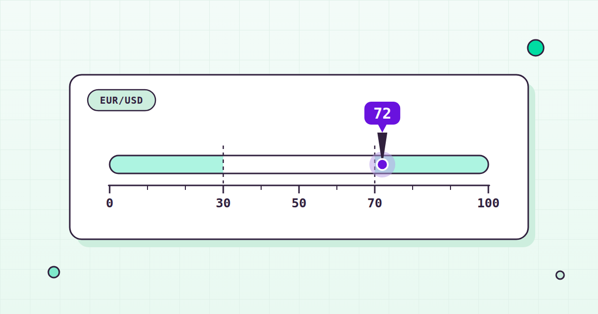
It is also why experienced traders treat indicators as context rather than commands. A reading of 75 on an oscillator is a description of what price just did over a specific window. What you make of that description is the part no formula supplies – and no formula on this page will claim otherwise.
How Do Forex Indicators Work?
Almost every indicator in this article is built from the same handful of ingredients: the high, low, and close of each period, smoothed or compared over a lookback window. (You will see 14 periods over and over as the default lookback – that is convention more than mathematics.)
The usual way to organize forex trading indicators is by the question each one answers:
- Trend indicators describe the direction or strength of a sustained move. MACD, Parabolic SAR, the Ichimoku Cloud, and ADX live here.
- Momentum oscillators measure where the latest close sits relative to recent history, usually on a bounded scale. The stochastic oscillator, RSI, and Williams %R are the classics.
- Volatility indicators measure how much price is moving, without regard to direction. Bollinger Bands and ATR.
- Volume-based indicators relate price movement to trading activity. In forex this category comes with a large asterisk – see the next section. The Market Facilitation Index is the example on this list.
Two structural things apply to the whole family. First, indicators are computed from past prices, so they lag by construction – a smoothed line can only turn after price does. Second, in choppy, directionless markets that lag shows up as whipsaw: the indicator flips one way, price reverses, the indicator flips back, and a tool that looked decisive in a trend looks indecisive in a range. Neither of these is a flaw someone forgot to fix. They are properties of averaging, and every indicator built on averages carries them.
The Forex-Specific Caveat: There Is No True Volume
Forex has no real volume number. Let me explain, because this is the single most useful caveat in this entire article.
Forex is a decentralized, over-the-counter market. Currencies trade across many venues and dealing desks at once, with no central exchange and no single consolidated tape. That structure has a concrete consequence: there is no true traded-volume figure for a currency pair the way there is for an exchange-listed stock, where every share printed on the tape gets counted.
So what is the “volume” your charting platform displays on a forex chart? Almost always it is tick volume: the number of price changes in a period, used as a proxy for real volume. It is a reasonable proxy – busy periods do tend to produce more ticks – but it is a proxy, and the count depends on whose feed you happen to be watching.
Keep that in mind any time a forex indicator claims to incorporate volume, including the Market Facilitation Index below. In forex, “volume-based” means “tick-based.”
11 Popular Forex Indicators Explained
Here are the eleven, in no particular order of merit. The parameters listed are the common conventions – most platforms let you change them, though the defaults are what most other eyes are watching.
1. Bollinger Bands
Bollinger Bands start with a moving average – commonly 20 periods – and draw an upper and lower band a set number of standard deviations away from it, commonly 2. Because standard deviation is a volatility measure, the bands are dynamic: they widen when volatility rises and narrow when it falls.
That construction answers one question well: is price high or low relative to its own recent behavior? A close near the upper band is elevated compared to the recent average; a close near the lower band is depressed. The width of the bands is a second reading in its own right – a narrow, quiet stretch and a wide, fast-moving stretch are different volatility regimes, and the bands make the difference visible instantly, on any timeframe you chart.
Traders use them for exactly that: relative context on where price sits, plus a live picture of how volatile a pair currently is.
The honest limitation: touching a band is not a signal. In a strong trend, price can ride the upper or lower band for a long time, staying pinned against it while the move keeps extending. The bands tell you price is stretched relative to its recent past; they say nothing about whether the stretch is ending.
2. Stochastic Oscillators
The stochastic oscillator is a momentum oscillator bounded between 0 and 100. It asks one question: where did price close relative to its full high-low range over a lookback period, commonly 14? A reading near 100 means the close sat at the top of that range; a reading near 0 means the bottom.
It plots two lines. %K is the raw calculation. %D is a short moving average of %K – commonly 3 periods – which smooths the raw line into something easier to follow. By convention, readings above 80 are called “overbought” and readings below 20 “oversold.”
Those words earn their quotation marks. The thresholds are conventions, not rules – nothing in the arithmetic makes 80 special, and “overbought” here means only “closing near the top of its recent range.” Which, you may notice, is also a plain description of what trending upward looks like.
The honest limitation: exactly that. In a strong trend, a stochastic can sit above 80 or below 20 for a long stretch, because repeatedly closing near the edge of the range is what strong trends do. The oscillator describes position within the range; it does not referee whether the range itself is about to shift.
3. Fibonacci Retracements
Fibonacci retracements are horizontal levels drawn at fixed percentages of a prior move: 23.6%, 38.2%, 50%, 61.8%, and 78.6%. If a pair rises and then pulls back, the tool marks how much of the original move has been given back – a pullback to the 38.2% line has retraced a little over a third of the advance.
Two things, stated plainly. First: 50% sits in the set purely by convention, not as a true Fibonacci ratio, because traders like the halfway mark. Second: no mysticism is required here, and we are not going to supply any. The honest case for these levels is circular but real – they are widely watched partly because they are widely watched. When a large number of participants mark the same lines on the same chart, those lines become focal points, and having them pre-labeled saves you from guessing where everyone else is looking.
In practice, traders use retracements as a shared vocabulary for pullback depth: shallow, halfway, deep. That vocabulary is genuinely convenient, and it costs nothing to learn.
The honest limitation: nothing in the math obliges a market to respect any of these levels. A pullback can stop between the lines, or slice through all five, and the tool cannot tell you in advance which it will be.
4. Moving Average Convergence Divergence (MACD)
MACD is built entirely from exponential moving averages (EMAs) – moving averages that weight recent prices more heavily than older ones. The MACD line is the 12-period EMA minus the 26-period EMA. The signal line is a 9-period EMA of the MACD line itself. The histogram is the MACD line minus the signal line.
What does a difference of two averages measure? Momentum, roughly. When the shorter average pulls away from the longer one, recent prices are moving faster than the older trend, and the MACD line grows. When the gap narrows, the move is decelerating. The signal line and the histogram exist to make changes in that gap easier to see – the histogram in particular is a bar-by-bar picture of acceleration and deceleration.
Traders read the whole assembly as a compact trend-and-momentum summary: which side of zero the MACD line sits on, where it is relative to its signal line, and whether the histogram is growing or shrinking.
The honest limitation: MACD is moving averages all the way down, so it inherits moving-average lag in full. It confirms turns after they have begun; it does not anticipate them. And on a choppy, rangebound chart, that lag produces the whipsaw behavior described earlier in force.
5. Relative Strength Index (RSI)
RSI is a momentum oscillator bounded between 0 and 100, computed over a lookback of commonly 14 periods. It compares the magnitude of recent gains against recent losses: when up periods have dominated the window, RSI runs high; when down periods have dominated, it runs low. By convention, readings above 70 are called “overbought” and readings below 30 “oversold.”
RSI’s appeal is its compactness. One bounded number summarizes how one-sided the recent window has been – on any pair, on any timeframe – which is a big part of why it shows up on nearly every charting platform and in nearly every quant library.
The honest limitation: RSI can stay stretched in a strong trend, and often does. A pair grinding steadily higher keeps producing gains, which keeps RSI elevated – sometimes for a long time. An “overbought” reading is a description of recent one-sidedness, not a countdown to its end. Treat the conventional thresholds as vocabulary, not verdicts.
6. Average True Range (ATR)
ATR measures volatility. That is the whole job, and it does the job carefully. The “true range” of a period is the greatest of three values: the current high minus the current low; the absolute value of the current high minus the previous close; and the absolute value of the current low minus the previous close. ATR is the average of that true range over N periods, commonly 14.
Why the previous-close comparisons? Gaps. If price jumps between one period’s close and the next period’s range, a simple high-minus-low would miss the jump entirely. True range counts it as the movement it was.
Traders use ATR as a volatility yardstick: how much does this pair typically move in a period right now? That is useful for comparing regimes (this month versus last month), comparing one pair against another, and calibrating expectations for how much room price naturally covers in a session. Quiet pair, small ATR; wild pair, large ATR. The number itself is in price units, not a bounded scale.
The honest limitation: ATR is direction-blind – it says how much, not which way. A rising ATR is equally consistent with a powerful rally and a violent selloff. It is a measuring stick, it never claimed to be anything else, and it is best used as one.
7. Parabolic SAR (Stop and Reverse)
Parabolic SAR plots a series of dots that trail price: below price during an uptrend, above price during a downtrend. As a move extends, the dots tighten toward price, trailing closer and closer – and when price finally crosses them, the indicator flips to the other side of the chart. That flip is the name: stop and reverse.
Traders use it for two things. As a trend read it is unambiguous – the dots are either below price or above it, with no shades of gray. And as a trailing reference, the tightening dots trace a path that ratchets along behind a move, which is why the indicator is so often associated with trailing stops.
The honest limitation: Parabolic SAR whipsaws badly in sideways, non-trending markets. The mechanism has no idle setting – the dots are always on one side or the other – so in a range they flip back and forth repeatedly, calling reversals in a market that is not reversing so much as drifting. It is a trend-following tool in the strictest sense: without a trend to follow, it manufactures noise.
8. Ichimoku Cloud (Ichimoku Kinko Hyo)
Ichimoku Kinko Hyo (usually shortened to “Ichimoku Cloud,” for understandable reasons) is not a single line but a full system of five, drawn together on the price chart:
- Tenkan-sen – the conversion line, computed over roughly 9 periods.
- Kijun-sen – the base line, computed over roughly 26 periods.
- Senkou Span A and Senkou Span B – the two leading lines, plotted ahead of price. The gap between them is shaded, and that shaded zone is the “cloud” (the Kumo).
- Chikou Span – the lagging line, plotted roughly 26 periods back.
The design goal is a one-glance chart. Where price sits relative to the cloud, how the five lines are arranged, and how thick the cloud is combine into a single visual read on trend, and the cloud itself is read as a zone of support or resistance – a region rather than a single level, which is a genuinely useful way to think about levels in a market as fluid as forex.
The honest limitation: Ichimoku is information-dense, and it lags. Five lines and a shaded zone summarize a lot at once, which takes real time to learn to read, and every one of those lines is still derived from past prices. It works best in trending conditions; in a sideways market, price weaves in and out of the cloud and the one-glance picture stops being one-glance.
9. Williams %R
Williams %R is a momentum oscillator with an unusual scale: it is bounded from -100 to 0. It measures where the close sits relative to the high-low range over a lookback, commonly 14 periods. A reading near 0 means the close was near the top of that range; near -100, the bottom. By convention, readings above -20 are called “overbought” and readings below -80 “oversold.”
If that sounds familiar, it should. Williams %R is effectively an inverted stochastic – the same question (where in its recent range did price close?) on a flipped scale. Some traders simply prefer this presentation, and that is a fine reason to use it.
The honest limitation: because it is the stochastic’s mirror image, it adds no information a stochastic does not already provide. Running both on the same chart is charting the same quantity twice. Remember the framing from the top of this article – clarity, not information – and pick whichever presentation your eye reads faster.
10. Market Facilitation Index (MFI)
The name first, because there is a genuine trap here. This is Bill Williams’ Market Facilitation Index. It is frequently confused with the Money Flow Index – a completely different indicator (a volume-weighted cousin of RSI) that happens to share the same three-letter abbreviation. When you read about “MFI” anywhere, check which one is meant. Here, it is Bill Williams’ version.
The computation is compact: (High - Low) / Volume for the period. That is price movement per unit of volume – how much ground price covered for the activity that occurred. It is not read as a standalone number on a fixed scale; the convention is to read it alongside whether volume rose or fell versus the prior bar, so the pair of facts together (range-per-volume up or down, volume up or down) describes how movement and activity are changing relative to each other.
The honest limitation: in forex, the “volume” in that formula is tick volume – the count of price changes, not true traded volume, because forex’s decentralized structure produces no consolidated tape. Bill Williams’ MFI on a currency chart is therefore range per tick, one step further removed from true traded activity. It can still organize what you are seeing, but hold it more loosely than you would on an exchange-listed market where volume is a real, counted thing.
11. Average Directional Index (ADX)
ADX is part of Welles Wilder’s Directional Movement System, and it answers one narrow question: how strong is the current trend? Not which direction – how strong. It is bounded from 0 to 100, commonly computed over 14 periods, and derived from two companion lines, +DI and -DI (the positive and negative directional indicators).
By convention, readings above roughly 25 suggest a trending market, and low readings suggest a weak or absent trend. That makes ADX something like a regime gauge. Traders consult it to judge whether the market in front of them is the trending kind or the sideways kind – and given how differently the other indicators on this list behave in each regime, that is a genuinely useful thing to know. (Recall Parabolic SAR’s whipsaw problem. An ADX reading is one way traders gauge whether they are standing in whipsaw country.)
The honest limitation: ADX measures strength, not direction. A strong downtrend and a strong uptrend can produce the same high reading, so the ADX line alone cannot tell you which way anything is going – that context has to come from the +DI and -DI lines, or from the chart itself.
The 11 Forex Indicators at a Glance
A quick recap of what each tool computes, for reference:
| Indicator | What it measures | Common parameters | Scale |
|---|---|---|---|
| Bollinger Bands | Volatility and price relative to its recent average | 20-period MA, bands at 2 standard deviations | Plotted on price |
| Stochastic Oscillator | Momentum: close vs. recent high-low range | 14-period lookback; %D = 3-period MA of %K | 0 to 100 |
| Fibonacci Retracements | Depth of a pullback vs. a prior move | Levels at 23.6%, 38.2%, 50%, 61.8%, 78.6% | Levels on price |
| MACD | Trend and momentum via EMA gap | 12- and 26-period EMAs, 9-period signal | Unbounded, around zero |
| RSI | Momentum: recent gains vs. losses | 14 periods | 0 to 100 |
| ATR | Volatility: average true range | 14 periods | Price units |
| Parabolic SAR | Trend direction; trailing reference | Dots trailing price, tightening as a move extends | Plotted on price |
| Ichimoku Cloud | Trend plus support/resistance zone | Five lines; ~9 and ~26 period settings | Plotted on price |
| Williams %R | Momentum: close vs. recent range (inverted stochastic) | 14 periods | -100 to 0 |
| Market Facilitation Index | Price range per unit of (tick) volume | (High – Low) / Volume | Read vs. prior bars |
| ADX | Trend strength, not direction | 14 periods, from +DI and -DI | 0 to 100 |
Good Forex Indicators Need Good Forex Data
Every indicator in this article is a transformation of price data. Which means every one of them is exactly as good as the data you feed it – a 20-period average of a spotty feed is just a smooth line drawn through spotty numbers.
This is the part Tiingo plays, and it is the reason we exist at all. Since 2014, our mission has been making high-end financial data accessible and affordable to everyone. Our motto is “Actively Do Good,” and it is not decoration – it is the operating principle: license good data, price it at cost, and be generous with the limits.
Our forex coverage: 140+ currency pairs, real-time and historical, with forex history back to 2020. Two endpoints do most of the work:
# Latest top-of-book quotes for one or more pairs
https://api.tiingo.com/tiingo/fx/top?tickers=<pairs>&token=<token>

# Historical prices for a pair
https://api.tiingo.com/tiingo/fx/<ticker>/prices?token=<token>
Pricing is flat-rate and licensed, built in the spirit of “how much can we give and get away with it?” The free Starter plan is $0 and includes 500 unique symbols per month, 50 requests per hour, and 1,000 requests per day – plenty to compute every indicator in this article on the pairs you follow. Power is $30/month, and Commercial is $50/month.
How is that pricing possible? Because we never took venture money – not a dollar – and Tiingo has been profitable for 8+ years. There is no growth-at-all-costs math that someday needs to be extracted from you. Sustainable disruption is slower, and it is the only kind we wanted.
If you want to build with it, the forex documentation covers both endpoints in detail, and the forex API page is the place to start. Compute your indicators on clean data – of everything on this page, the quality of the input is the one thing fully in your control.
From all of us at Tiingo: happy charting.