
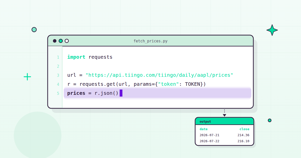
Ask anyone doing serious market work what language they use and you’ll almost always get the same answer. Python for finance became the default for good reasons: the language reads nearly like English, it ships with batteries included, and the open-source data libraries built around it are some of the best software ever written, at any price. Hedge funds use them. Academic researchers use them. And – this is the part I love – a curious person with a laptop and a free API token can use the exact same tools. High-end tooling, made accessible to all.
I’m a data nut, so rather than tell you Python is great, I’d rather show you. By the end of this guide you will have pulled real daily price history into Python, computed returns and volatility, and plotted the result – about 20 lines of code in total. No “what is Python” chapter and no machine learning detour. Just the actual work.
The Python for finance toolkit: four libraries that matter
There are hundreds of thousands of Python packages. Financial analysis with Python rests on a very small core of them:
- requests – talks to web APIs. Any time you fetch data over HTTP, this is the tool. Simple, boring, reliable – exactly what you want.
- pandas – the workhorse. Its DataFrame is a table with superpowers, practically born for time series: date indexes, rolling windows, resampling, joins.
- numpy – fast numerical arrays and the math that runs on them. pandas is built on top of it, and you’ll reach for it directly whenever you need logs, square roots, or arithmetic across a whole column at once.
- matplotlib – plotting. Not the flashiest charts out of the box, but it is everywhere and it just works.
When you go deeper into statistics, scipy and statsmodels are waiting for you (hypothesis tests, regressions, and friends). But you can go a very long way with just the first three. Most exploratory market work is requests, pandas, and numpy, full stop.
Getting real market data into Python
Tutorials love toy CSVs. Markets are not toys, so let’s use real data: daily price history for Apple, pulled from our end-of-day API. If you want to follow along (please do – this is a typing-along kind of guide), grab a free API token at tiingo.com. The free Starter plan is $0 and covers 500 unique symbols a month with 30+ years of price history, which is far more than everything in this article needs. We built the free tier to be genuinely useful on purpose – we don’t believe in holding good data hostage.
import requests

url = "https://api.tiingo.com/tiingo/daily/aapl/prices"
params = {"token": "YOUR_TOKEN", "startDate": "2024-01-01"}
data = requests.get(url, params=params).json()
That’s the entire fetch. data is now a list of dictionaries, one per trading day, and each one is a daily bar: date, open, high, low, close, and volume, plus adjusted versions of the prices and volume (adjClose, adjOpen, adjHigh, adjLow, adjVolume). Hold that thought on the adjusted fields – they matter far more than most newcomers realize, and they get their own section below. The full response format is in our end-of-day API documentation.
A list of dictionaries is fine. A DataFrame is better:
import pandas as pd

df = pd.DataFrame(data)
df["date"] = pd.to_datetime(df["date"])
df = df.set_index("date").sort_index()
Three lines, each doing one job. pd.DataFrame(data) turns the list into a table. pd.to_datetime converts the date strings into real timestamps, which is what unlocks all of pandas’ time-series machinery. And set_index("date").sort_index() makes those dates the index, in chronological order, so slicing by date (df.loc["2024-03"] for one month, for example) just works.
Run df.head() and admire it for a second: a clean table of daily bars, one row per trading day, indexed by date. That structure – a datetime index with one column per field – is the foundation nearly all market data work in Python sits on. Get comfortable here and everything downstream gets easier.
Your first real analysis
Now the fun part. Let’s compute three of the most fundamental quantities in finance: daily returns, a moving average, and annualized volatility.
import numpy as np

df["return"] = np.log(df["adjClose"]).diff()
df["ma20"] = df["adjClose"].rolling(20).mean()
annualized_vol = df["return"].std(ddof=1) * np.sqrt(252)
Line by line:
- Returns.
np.log(df["adjClose"]).diff()takes the logarithm of each adjusted close, then differences consecutive days. These are log returns, and quants are fond of them because they add cleanly across time: sum a month of daily log returns and you get the month’s log return. Notice we usedadjCloserather thanclose. That is deliberate, and the section after next explains why. - Moving average.
.rolling(20).mean()averages the prior 20 trading days at every point – roughly one month of trading. It smooths out the daily noise so the trend is visible. - Volatility.
.std(ddof=1)is the sample standard deviation of those daily returns. Multiplying bynp.sqrt(252)scales it to an annual figure, because a year has about 252 trading days and volatility grows with the square root of time. That single number, annualized vol, is the standard yardstick for how bumpy a ride a stock has been.
Three lines, and you’ve done genuine quantitative analysis – the same calculations that sit inside professional risk systems. One caveat that applies to everything in this guide: these numbers describe the past. They are not a prediction, and nothing here is investment advice.
Plotting it
Numbers in a table hide things a chart makes obvious. Context in markets is everything, and a chart is the fastest context there is.
import matplotlib.pyplot as plt

fig, ax = plt.subplots(figsize=(10, 5))
ax.plot(df.index, df["adjClose"], label="Adjusted close")
ax.plot(df.index, df["ma20"], label="20-day moving average")
ax.set_title("AAPL adjusted close")
ax.legend()
plt.show()
plt.subplots creates the figure, the two ax.plot calls draw the price and its rolling average against the date index, and plt.show() renders it. You should see the price wiggling around a smoother line – the moving average trailing the close like a calm friend. When the two cross, that’s the kind of moment traders start arguing about.
Why adjusted prices matter
Here is the gotcha that bites nearly everyone exactly once.
Suppose a company does a 4-for-1 stock split. Every shareholder now owns four shares at a quarter of the price, so economically nothing happened. But in the raw close column, the price just dropped roughly 75% overnight. If you compute returns from close instead of adjClose, your data now contains a catastrophic crash that never occurred, and every statistic downstream of it – volatility, correlations, backtest results – is quietly poisoned. One split can undo months of careful work.
Dividends are subtler but just as real. When a company pays a dividend, its price typically dips by about that amount, but shareholders received cash. Raw closes record the dip and ignore the cash, so a returns series built on them understates what holding the stock actually earned. Compound that over years of a steady dividend payer and the gap becomes serious.
Adjusted prices fix both: splits and dividends are folded back into the series so the numbers reflect economic reality. That is why every calculation in this guide uses adjClose.
It is also exactly the kind of thing your data provider should carry for you. Corporate actions are constant, messy, and deeply unglamorous, and handling them well is a monk-like responsibility – clean data should be boring. Every price we serve is split- and dividend-adjusted and error-checked, precisely so that a returns calculation written at your kitchen table behaves like one written on a trading desk.
Where to go next
You now have the loop that most professional market work is built on: fetch, frame, compute, plot. Some natural next steps, in rough order of fun:
- Backtest a simple rule. You already have a moving average; you could test what holding only when price sits above it would have done historically. Be ruthlessly skeptical of your own results – the classic mistake is letting tomorrow’s information sneak into today’s decision, and it flatters every strategy it touches.
- Go deeper into history. Our end-of-day data reaches back to 1962. Long histories keep you honest: an idea that looks brilliant over five years can fall apart over fifty. The stock API covers 80,000+ assets across US equities, ETFs, mutual funds, and Chinese A-shares, so there is plenty to explore.
- Add context. Prices tell you what happened; fundamentals and news help explain why. We carry 20+ years of fundamentals and 70M+ news articles, and they join onto your price DataFrame with the same pandas patterns you just learned.
- Automate it. A small script on a nightly schedule (cron is fine) can pull fresh bars and append them to a growing local dataset. The Starter plan’s limits – 50 requests an hour, 1,000 a day – fit a nightly job comfortably.
- Try other markets. The same fetch-and-frame pattern works for our crypto data (150+ exchanges) and forex (140+ currency pairs). Different tickers, same muscle memory.
And yes, eventually machine learning, if that’s your thing – but the fundamentals above will carry you further than most people expect.
The bottom line
You don’t need expensive terminals or anyone’s permission to do real financial analysis anymore. A laptop, about 20 lines of Python, and good clean data will get you from zero to returns, volatility, and a chart in an afternoon. That accessibility is the whole reason Tiingo exists: we’ve been making high-end market data accessible and affordable since 2014, with no outside investors and 8+ years of profitability, which is what lets us keep asking “how much can we give?” instead of “how much can we charge?” Our motto is Actively Do Good, and handing a beginner the same data quality a fund gets is our favorite way of doing it.
The Starter plan is $0, and if you outgrow it, plans start at $30/month for individuals. Grab a free API token, paste in the snippets above, and go analyze something. If you build something neat, we’d genuinely love to see it.